

In this article, we will take a look at the fundamentals of color theory for garden design and strategies that designers can use to adopt beautiful color schemes into their landscapes.
Color theory has been widely studied and utilized within the design disciplines. But for most garden designers, selecting the proper color scheme for a project can be an intimidating task. The fear of color selection stems primarily from the nature of our discipline – pun intended. The garden design profession utilizes natural materials that are always changing and being altered by site-specific conditions.
Let’s think for a second about one of the main components of any well-designed garden – the flower. A flower’s size, bloom-time, color, and hue can be drastically different from site to site. These alterations within the flower are often the result of soil characteristics, sun patterns, and seasonal microclimates. How can a designer navigate all of these environmental conditions and remain confident in their final design proposal?
I will try to demystify the complexity of color selection and provide insight into how a designer can utilize color to create a beautiful landscape for any site.
Color Terminology
First, we must ground ourselves in the basics of color. Traditionally, most design professionals utilize color through the adaptation of the Standard Color Wheel. The color wheel is formed by three groupings – primary, secondary, and tertiary.
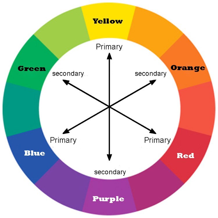
The primary colors are blue, yellow, and red. The secondary colors (green, orange, and purple) are formed by the mixing of the three primary colors. Finally, the tertiary colors (red-orange, red-purple, blue-purple, blue-green, yellow-green, and yellow-orange) are formed by the mixture of a single primary and single secondary color.
The color wheel does not need to stop at tertiary colors. There are several iterations of colors within the wheel itself, but for our purposes, the standard primary/secondary/tertiary groupings should suffice.
When dissecting the aspects of color theory, a reader will often run into rather confusing vocabulary depending on the educational source and subject being discussed. The terms hue, value, tint, and shade are just some of the often misinterpreted words in the artistic fields.
Hue is best understood as the core, or dominant, color of the specific color-type you are looking at. For example, if you look at the figure below, you can see that each stripe is a different color, yet they all are derived from a red hue. In most circumstances, a hue can be derived from primary, secondary, and tertiary colors.
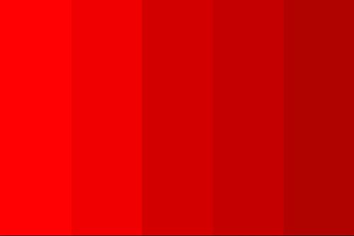
The term tint is simply a hue with the addition of white. Therefore, a tint always lightens a color. Again, when viewing the figure above, you can see that each of the four stripes are of the same hue, but have different degrees of tint. Sometimes you may hear a person describe a tint as a pastel, which is both common and acceptable terminology within color theory.
Shade is the opposite of tint – whereby black is added to the hue rather than white. The core hue starts as a lighter color and is then manipulated into different shades through the addition of black.
Once tint and shade are understood, the term value is easy. Value simply refers to the relative lightness (tint) or darkness (shade) of the color. It is a conditional term referring to the degree of change within the color. Manipulating the values of a color simply means adding more white, or black, to the core hue. In the figure below, the far-left stripe has a lighter value than the far-right one.

A final term for a designer to properly understand color theory is saturation. Saturation, sometimes also referred to as chroma, can be seen as a stand-alone term within the context of our discussion. It is defined as the relative intensity of the color.
A color with high saturation often looks bold and powerful within a scene, whereby one with low saturation can look weak or dull among its surroundings. Within the context of garden design, the saturation of a color palette can change drastically depending on the environmental conditions – primarily sunlight – of the project site. Designers can use this to their advantage in certain circumstances. For example, underneath a tree canopy, the darker filtered sunlight can increase the perceived saturation of red flowers, but will likely weaken the intensity of blue ones.
Monochromatic Color Schemes
When selecting a color scheme, monochromatic might seem like the simplest and obvious choice for the beginning garden designer; however, this could not be further from the truth. Unless a great deal of unnecessary landscape maintenance is employed, a monochromatic color scheme is impossible within a natural landscape.
This universal truth is not artistic, but biological. Plant foliage is primarily shades of green and there is no eliminating that fact. Even with the addition of mulch, stone, or fencing, the design automatically diverges from a monochromatic schema. The creative garden designer must intelligently employ other colors as a way to highlight, contrast, or complement the shades of green naturally found within the landscape being created.
It is important to understand that this does not mean that every design color choice needs to be interpreted in relation to green. There are situations in which outdoor living spaces, patios, walkways, and other elements may have color programs that are unrelated to green. This is perfectly fine – we will explore these as well. But for the majority of garden designs, a monochromatic design will usually be difficult and lackluster due to the inevitability of mother-nature wanting to paint with her own brush. Rather than try to control this force, a design’s color scheme should seek to enhance it. This is the mission of the following color schemes.
Complementary Color Schemes
Employing beautiful, consistent, and easily replicated complementary color schemes within a project should be a well-developed skill for any landscape designer. Complementary colors can be very effective for a variety of reasons. The scheme can add contrast or emphasis to specific areas in the garden. It can provide opportunities for year-round seasonal interest, where multiple complementary colors overlap. Finally, it is simplistic to develop but appears complex, which can add interest and depth to the viewer.
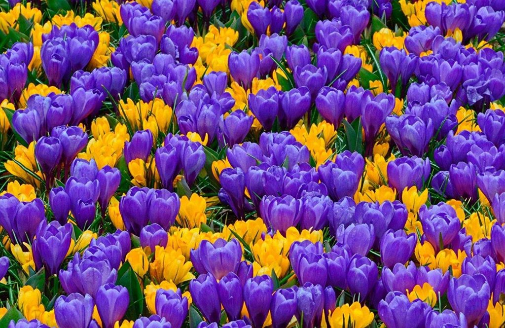
A complementary scheme is defined as specifying plants or materials with colors from opposite ends of the color wheel. The common complementary pairs include green-red, blue-orange, and yellow-purple. Secondary combinations can be created by merging these original pairs – such as a yellow-green complimented with a red-violet.
Now the idea of utilizing complementary colors may seem straight forward, but it is not without potential pitfalls. Simply because yellow and purple complement each other, this does not mean that you should place yellow-flowering plants with purple-flowering plants. This rather uninspired strategy will wreak unintended havoc on a garden design. So what is the solution? Think about some of the fundamental elements of design.
What is the shape and form of the flowers or plants you are specifying? Are they balanced and in harmony with each other? Are you adding contrast or emphasis within the plant schedule? The answers to all of these questions should be considered before blindly selecting the complementary color scheme for your design.
For example, if you consider the figure below. The grouping of plants below has a relatively low difference in flower size to maintain visual uniformity, but also intersperses the color compliments throughout the arrangement in order to add depth and complexity. This highlights the power of an effective complementary color scheme.
Designing with stone or paving is no different. Using a color scheme where a natural gray or bluestone is intermixed with orange or yellow colors can create a beautiful composition. The small color variations within the stone play nicely with the warmer colors as well.
In the table below, I provided some common complementary color strategies along with a list of some plant arrangements that can be utilized within the schemes.
| Complementary Color Pairs | Plant Pairings |
| Yellow & Purple | Forysthia (Forsythia x intermedia) Purple Smokebush (Cotinus coggygria) ___________________________________________ Black-Eyed Susan (Rudbeckia hirta) Lavender (Lavandula) ___________________________________________ False Sunflower (Heliopsis) Purple Salvia (Salvia nemorosa) ___________________________________________ Autumn Gold Ginkgo (Ginkgo biloba) Japanese Maple (Acer palmatum) |
| Blue & Orange | False Indigo (Baptisia australis) Red Hot Poker (Kniphofia) ___________________________________________ Blue Lobelia (Lobelia cardinalis) Pot Marigold (Calendula sp.) ___________________________________________ Blue Hydrangea (Hydrangea macrophylla)Serviceberry (Amelanchier canadensis) |
Split-Complementary Color Schemes
The split-complementary scheme is a derivation of the basic complementary strategy except for using two analogous complementary colors rather than a single one. This is often more recognizable in garden design because shades of foliage, pavers, and other seasonal materials are not uniform. It provides the designer with a greater amount of flexibility within the design while still achieving the desired result or effect.
A common split-complementary approach leverages the color green as a background for warmer red-violet and red-orange color highlights. The practice of adding split-complementary to your plant schemes can offer attractive, seasonally interesting views.
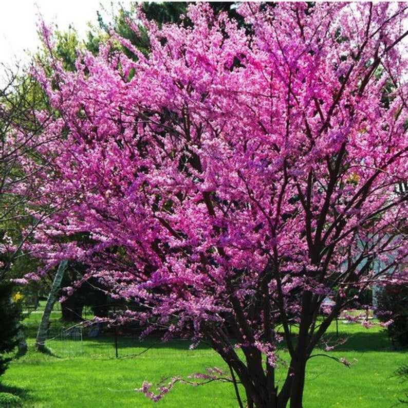
Cercis canadensis (Redbud) 
Psuedotsuga menziesii (Douglas Fir)
For example, for spring color I have found a backdrop of evergreen conifers (fir, cedar, or pine) with some nicer red or pink flowering specimen trees (magnolia, redbud, or cherry) to create a wonderful split complementary arrangement – shown above.
In Fall, a mixture of yellow or orange foliage (Maple, Aspen, Sourwood) can pair nicely with darker purples or browns (Smokebush, Ninebark, or Sweetgum) to create a rather stunning combination with no flowers at all – shown below.
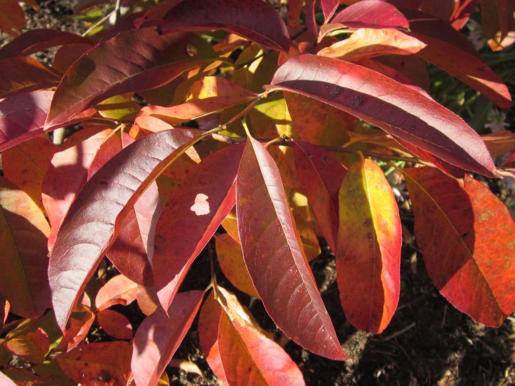
Oxydendrum arboreum (Sourwood) 
Cotinus coggygria (Smokebush)
It is important to note that the color schemes do not need to be viewed from a landscape perspective. Strategizing the placement and design of large annual patio containers within a garden can also have a powerful impact on the overall site. This is a circumstance where floral-designers may have an advantage over the new garden designer, but with a little practice, planter specifications are no different than gardens.
Analogous Color Schemes
When you first delve into the theory of color specifications, you may hear the terms warm and cool. These may not mean anything specific to the common designer – since they are adjectives of temperature rather than color – but most people understand darker colors (blue, purple) to be cool while lighter colors (yellow, orange) to be warm. Although these terms had little importance in the previous two schemes, they should be understood and used correctly for the analogous color strategies.
Analogous color schemes are identified by their use of colors directly adjacent to each other in one quadrant of the color wheel. The figure below shows the standard analogous color groupings. These patterns can be quite powerful when used in a design because analogous colors offer a great deal of flexibility with site-specific conditions (primary sunlight and color saturation issues).
A designer can add emphasis and contrast within a garden by emphasizing this warm-cool relationship within their plant or paving choices. An example of this strategy would be placing a warm color palette of plants near a cooler toned paving area. Within the planting bed, you might see hues of yellow, red, and orange; while the color palette of the pavers remains shades of blue and gray.
The analogous color scheme and complementary warm/cool technique can be also included within plant groupings by themselves. A taller backdrop of cooler-toned plants, such as Blue Spruce or Blue Atlas Cedar can provide a nice backdrop for shorter warmer toned Japanese Maples or Dogwoods.
Triadic & Tetradic Color Schemes
By now it must seem to the casual reader that there are so many color schemes available and a designer can’t possibly go wrong just tossing colors together at their whimsy. Surely all possible colors relate to each other in some type of standardized color scheme, right? There might be some validity to that statement – just ask Piet Oudolf – but this is where many designers get into trouble.
Thus far I have only discussed the “good” of garden design. I have told you to employ certain strategies that will make a beautiful garden. But I have yet to discuss things you shouldn’t do – which can be equally important to understand, especially in the context of color schemes.
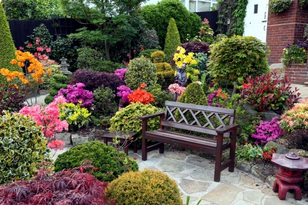
Look at the design in the figure above. You probably notice that it is unfocused, with no real hierarchy of color. The viewer’s eye does not know where to look first. This is an example of a poorly designed color scheme. Rather than over-saturating the landscape with color, the creative designer can highlight specific areas of importance and focus the viewer’s attention to those areas creating small “pops” of color.
These “pops” of color, as they are often labeled as, can change seasonally from spring through fall and provide a new interest year-round. It is within these seasonally changing blooms that a designer can utilize the triadic or tetradic color scheme.
If you are interested in learning more about landscape design, garden design, and basic design profession, please be sure to view our articles on 6 Essential Books for Landscape Design and Best Beginner Drafting Tools for Landscape Design.